The Pocket Pad
Reimagining intergenerational communication
Sep - Dec 2024 - Alongside product designer Yuri Kawada, part time designer Yit Chung, and part time researcher Yechan Choi
OVERVIEW
The Pocket Pad is a two-way contacting device that aims to foster authentic long-distance interactions between aging parents and working children. This intensive 8-week class project was completed during my first quarter at the University of Washington.
Yuri and I took turns leading the project from start to finish. I conducted 5 user interviews, 6 usability tests, and created over 20 high-fidelity prototypes as well as 5 iterative 3D models.
BACKGROUND
Working adults want to form close relationships with their parents
As an international student living continents away from my parents, I struggle to keep in close contact with them whilst balancing my full-time student workload. As a result, my relationship with my parents has become stagnant. Studies show that around 40% of elderly suffer from social isolation and loneliness on a day-to-day basis, which greatly affects their quality of life and family connections. Many working children with busy schedules want to foster closer relationships with their long distance parents…
How can we create a solution that shortens the widening gap between working children and their aging parents?
LOOKING OUT
Addressing and understanding the disconnect
To fully unveil the reasons why these problems existed, we first turned to interviews, surveys, and literary reviews. We synthesized our collected data through affinity mapping, and ultimately recognized four key pain points in the current communication experience.
PAIN POINT 1
Sometimes, there is an emotional barrier between aging parents and children, leading to surface level conversations and a lack of conversation topics.
PAIN POINT 2
Rapid technological advancements and products with steep learning curves make it increasingly frustrating for aging parents to use.
PAIN POINT 3
Working children often do not engage in high-effort communication, leading to a disconnect in communication frequency.
PAIN POINT 4
Aging parents crave personal communication methods, but the more personal it is, the more effort it requires.
Through over 40 survey responses and 9 interviews, we learned about the core qualities of a good long distance parent child relationship and problems with existing communication methods. By understanding the ideal relationship, we started to picture the gaps we could fill.
LOOKING IN
Refining our research question
With our newfound knowledge, we realized our problem scope was way too broad. In order to design with impact, we needed to utilize the HMW to encompass qualities both children and parents deemed significant when connecting with one another. So we rephrased our HMW to…
How can we facilitate emotional and casual interactions between young, working children and their aging parents whilst allowing them to enjoy activities together to produce mutual feelings of support and encouragement?
OUR TARGET USER
Understanding user groups to identify our target user
Another thing I realized during interviews was that there were a few people with no intention of changing the way they interacted with their parents. I developed 4 simple personas based on our two primary stakeholder groups to understand the range of motivation levels on a scale of indifferent to enthusiastic.
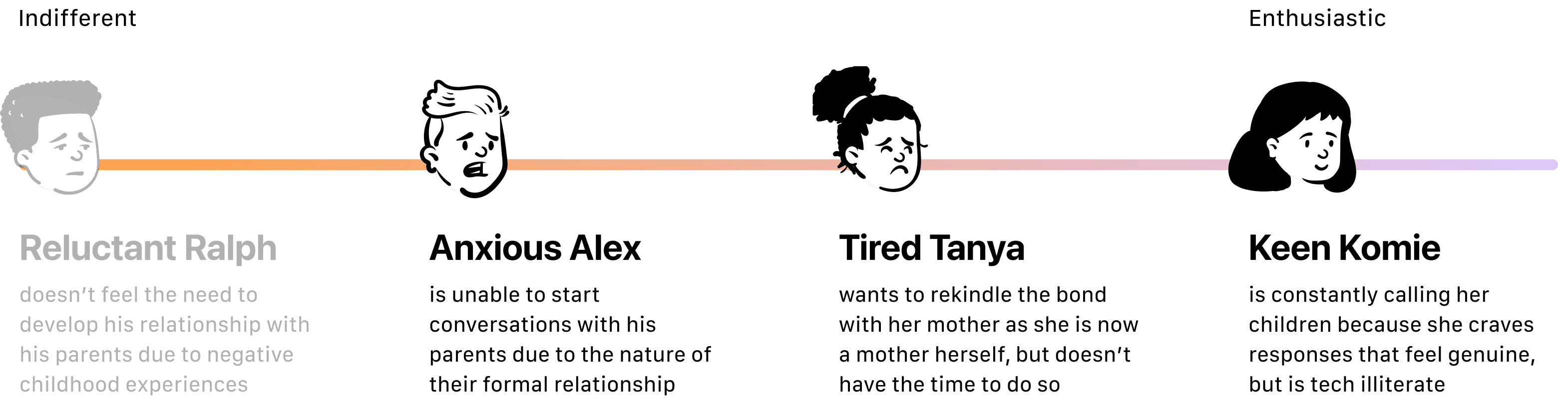
we decided to exclude Reluctant Ralph and cater our solution towards those who want to see improvement within their relationships. By focusing on the user persona that had the most concerns, in this case, Anxious Alex, we can create a minimum viable solution that addresses the point points of all focal personas.
FINAL 3 OPTIONS
Turning initial sketches into tangible mockups…
We conducted a series of crazy 8s to start brainstorming and then ultimately decided on the three ideas with the most votes. I presented our 3 finalists as low-fidelity 3D mockups and together we critiqued each one based off of impact, effort, and creative potential- our definition of success.
The Feeling Plate 🍽️
Watch Party 🎥
The Pocket Pad ✏️
THE MVP DESIGN
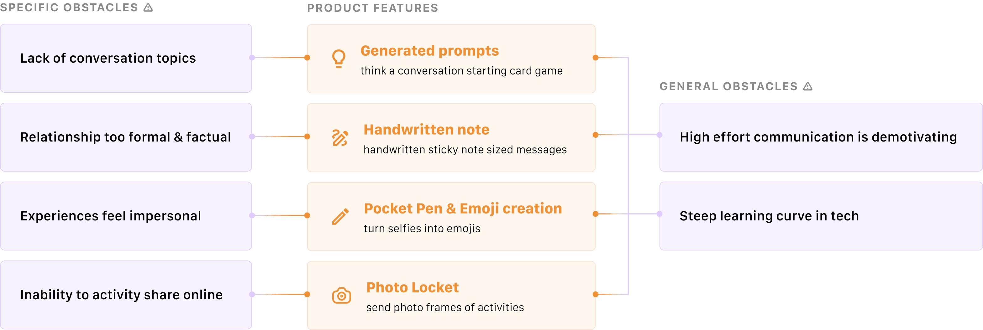
Refining features to target obstacles…
When selecting our key features for the pocket pad, we chose our solutions based on the determined pain points. We moved forward with four different features that directly combat those both specific and general experience obstacles.
DESIGN ITERATIONS
3 usability tests, 3 iterations
Now that we had our features in mind, we turned to testing to validate our design ideas. We conducted 3 rounds of usability testing, one for each time we made an iteration.
Exploratory/ Formative test 📋
Simply walking through and commenting on the screens to examine the concept’s effectiveness
Assessment/ Summative test 📝
Task Completion based with the purpose of identifying specific usability deficiencies in the product.
Each test was done in person, and each round consisted of 5 participants. We observed body language and asked follow up questions to find gaps within our product.
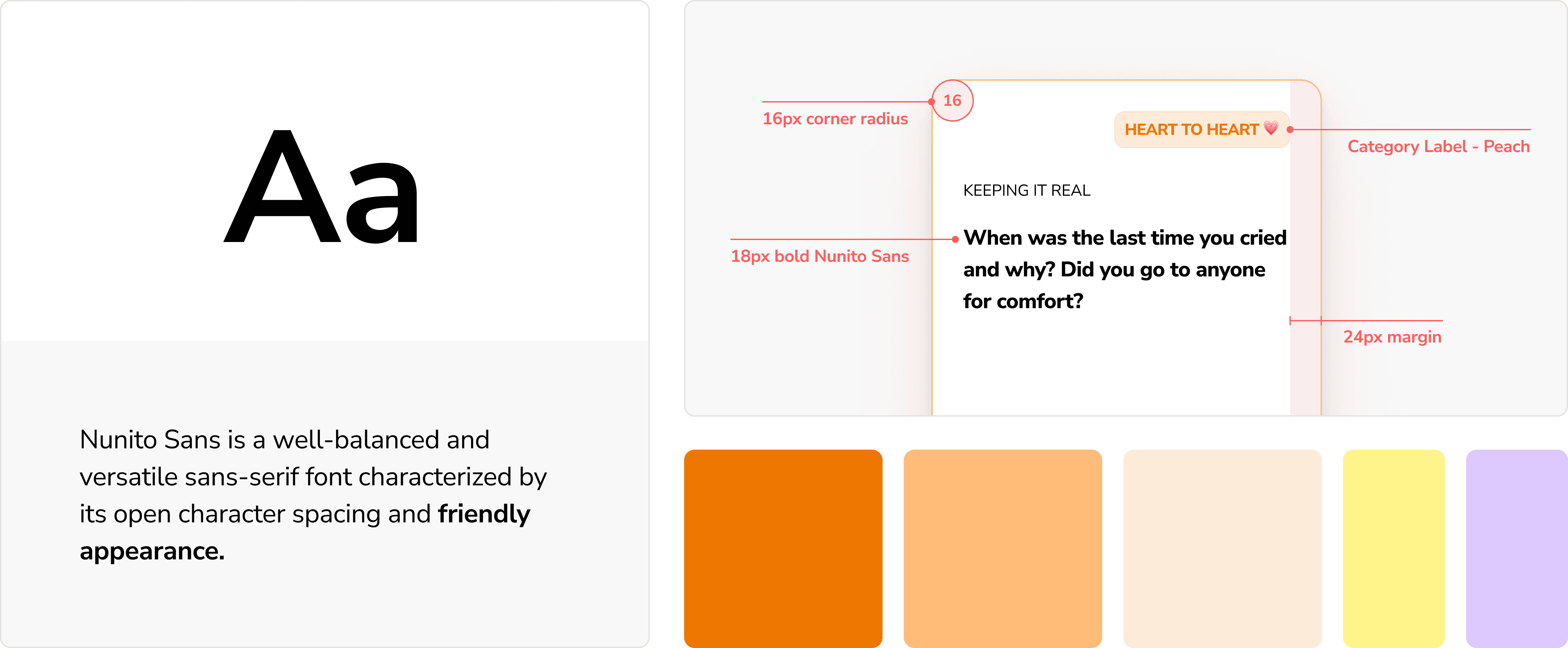
Conversation starter cards design
With the old design, users were not as receptive to the prompts function on a bottom screen because it wasn't as visually enticing to use. I came up with the idea of prompt cards instead, and utilized playful tags like "heart to heart" to categorize them based on question type.
Old Design

New Design
Design inspiration was taken from card games like "We're Not Really Strangers", where the levels of intimacy progress with different categories.
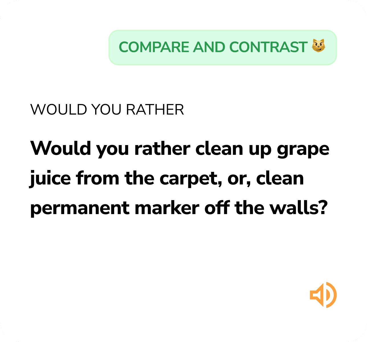
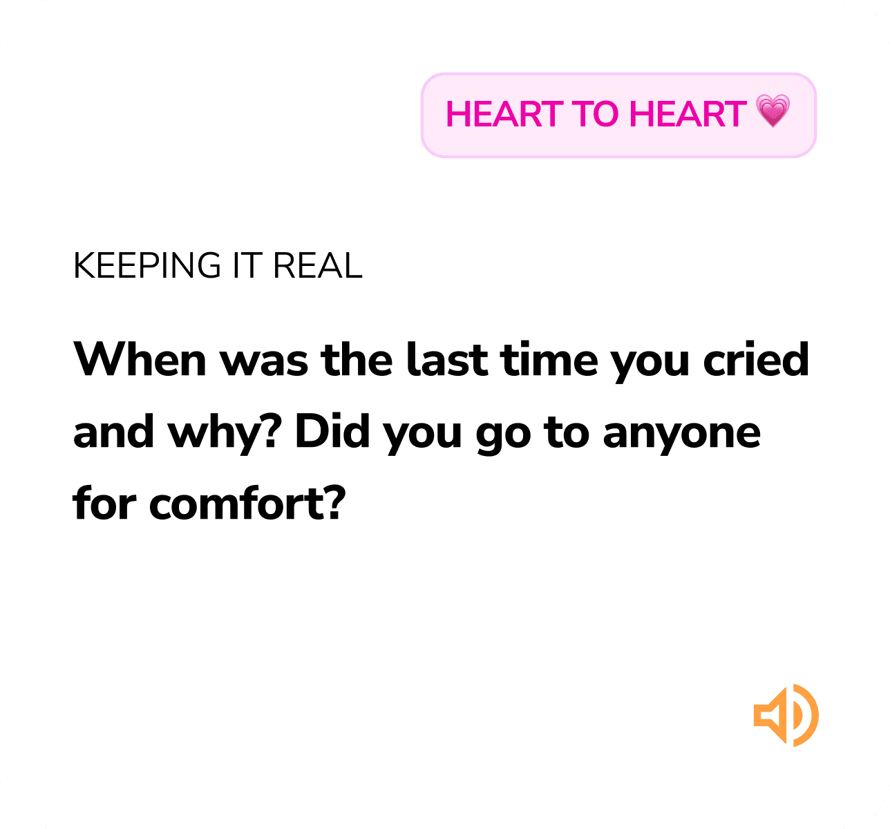
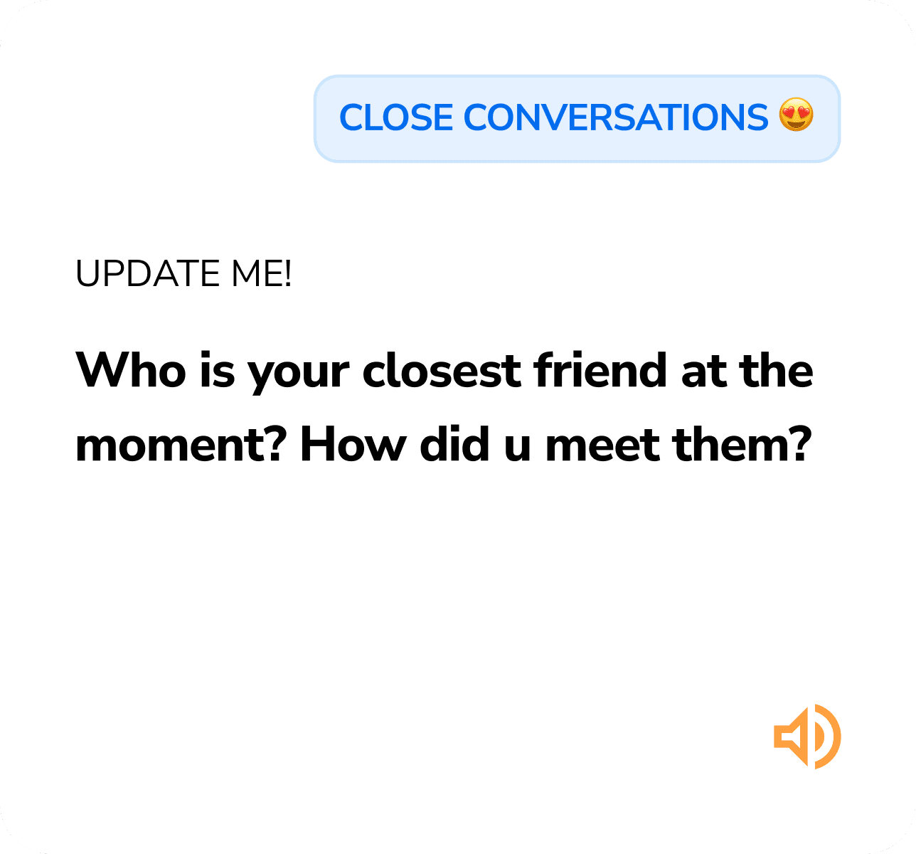
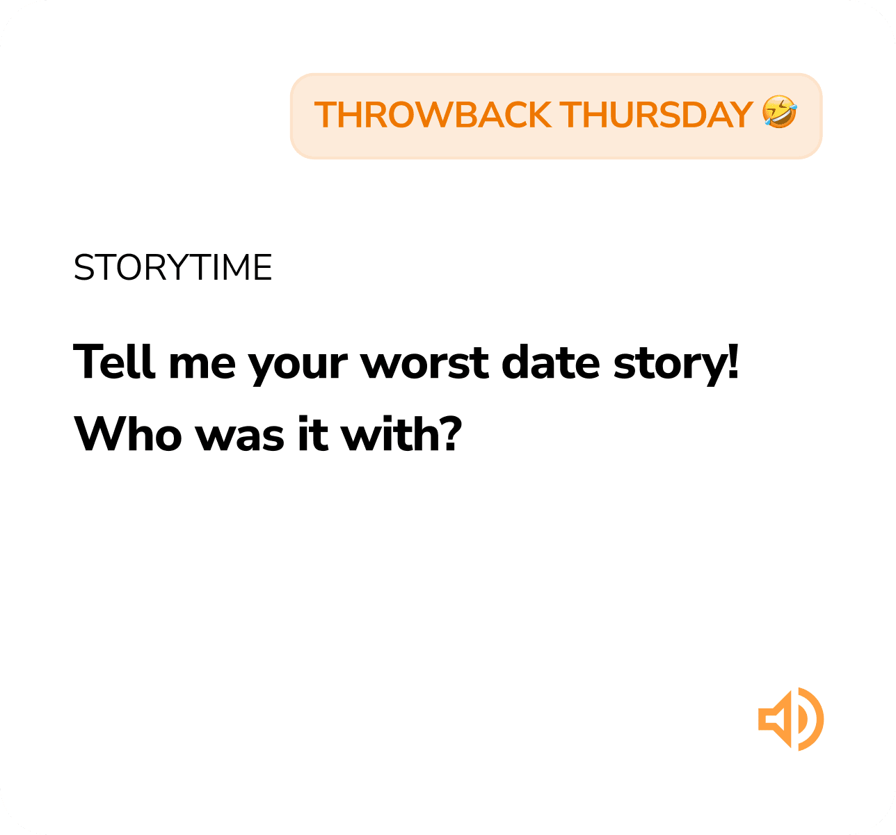
what if users could collect the types of cards they've answered based on different categories, and earn points relative to how "emotional" the card is?
Card layout options
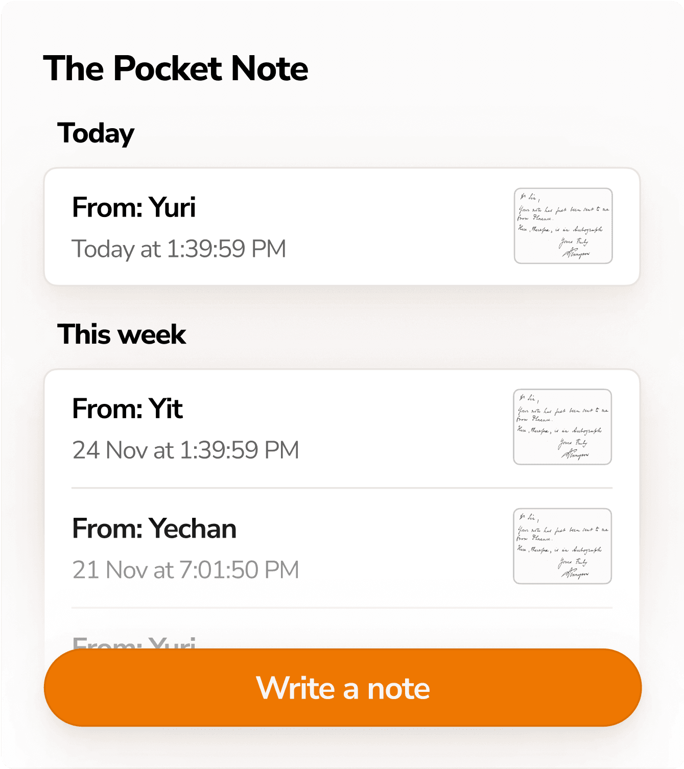
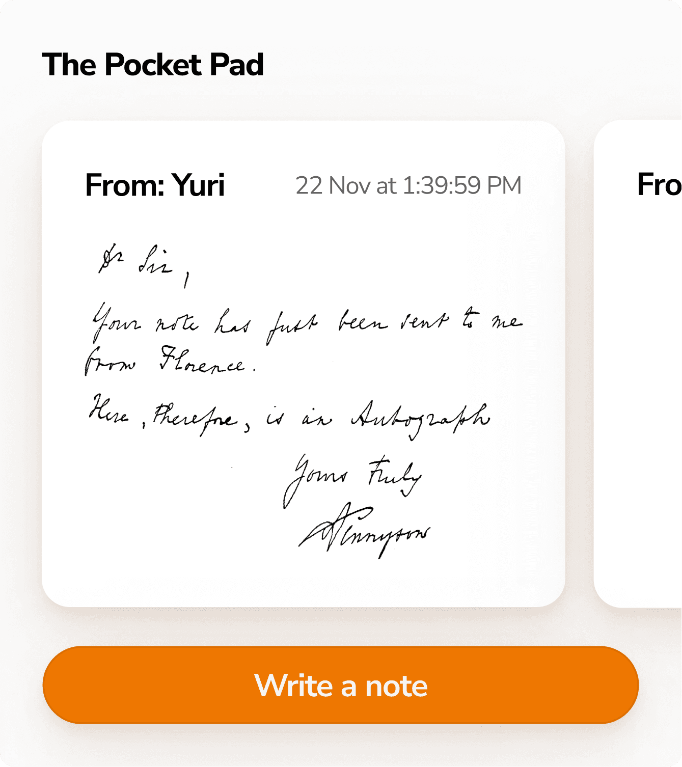
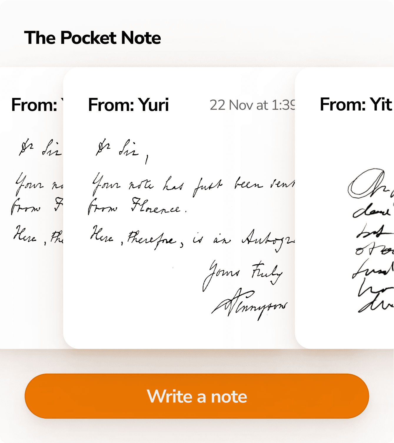
I also redesigned the way we display information to elderly users. This example is taken from the initial writing pad screen, where users can scroll through past "notes".
Option 1
Option 2
Option 3
I decided on Option 2 because horizontal scrolling seemed to match the Pocket Pad's physicality the best, and option two allowed users to see the entire note, rather than just part of the note.
1 product, 1 solution —> 2 PRODUCTS, 1 solution
I also redesigned the way we display information to elderly users. This example is taken from the initial writing pad screen, where users can scroll through past "notes".
Option 1
Option 2
Option 3
I decided on Option 2 because horizontal scrolling seemed to match the Pocket Pad's physicality the best, and option two allowed users to see the entire note, rather than just part of the note.
FINAL DESIGN
Introducing the Pocket Pad…
I also redesigned the way we display information to elderly users. This example is taken from the initial writing pad screen, where users can scroll through past "notes".
I decided on Option 2 because horizontal scrolling seemed to match the Pocket Pad's physicality the best, and option two allowed users to see the entire note, rather than just part of the note.
Send a quick note to your loved one!
Organic textures and handwritten elements reflect heartfelt exchanges, fostering meaningful and intimate communication that illuminates relationships. This feature enables handwritten messaging, making communication more heartfelt and personal.
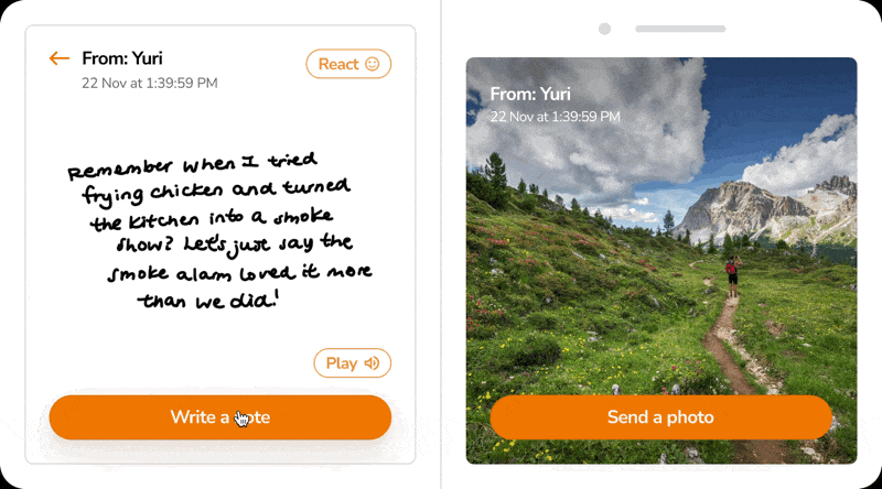
Can notes be favourited, highlighted, or categorized based on sender? What if the pocket pad had other day to day functions such as note-taking and list making?
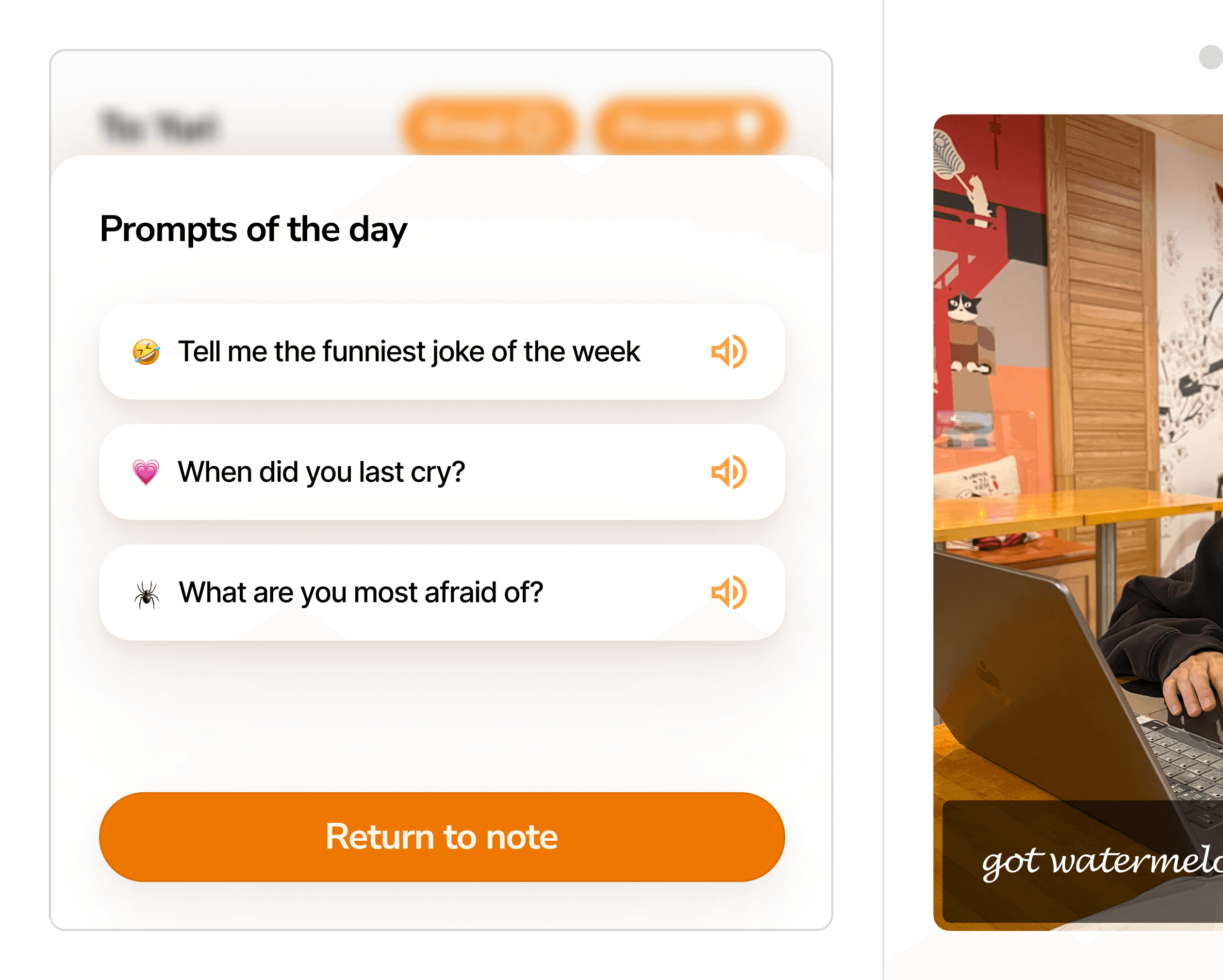
Choose a prompt to initiate the conversation!
Fun prompts are a good way to create casual relationships, this function addresses a trouble that many users seemed to have. It also incentivizes working children to take the initiative and answer a prompt to start a conversation
Snap a quick pic and send a photo locket!
Organic textures and handwritten elements reflect heartfelt exchanges, fostering meaningful and intimate communication that illuminates relationships. This feature enables handwritten messaging, making communication more heartfelt and personal.
How can we allow the user to browse past images without losing the integrity of it being a "photo frame"? Can this be expanded to live photos/ videos?
Customize your message!
This function Integrates the handwriting feature and default IOS emojis into the photo taking flow, which adds a layer of personality and authenticity to the experience.
DESIGN DETAILS
Ensuring details are passed on…
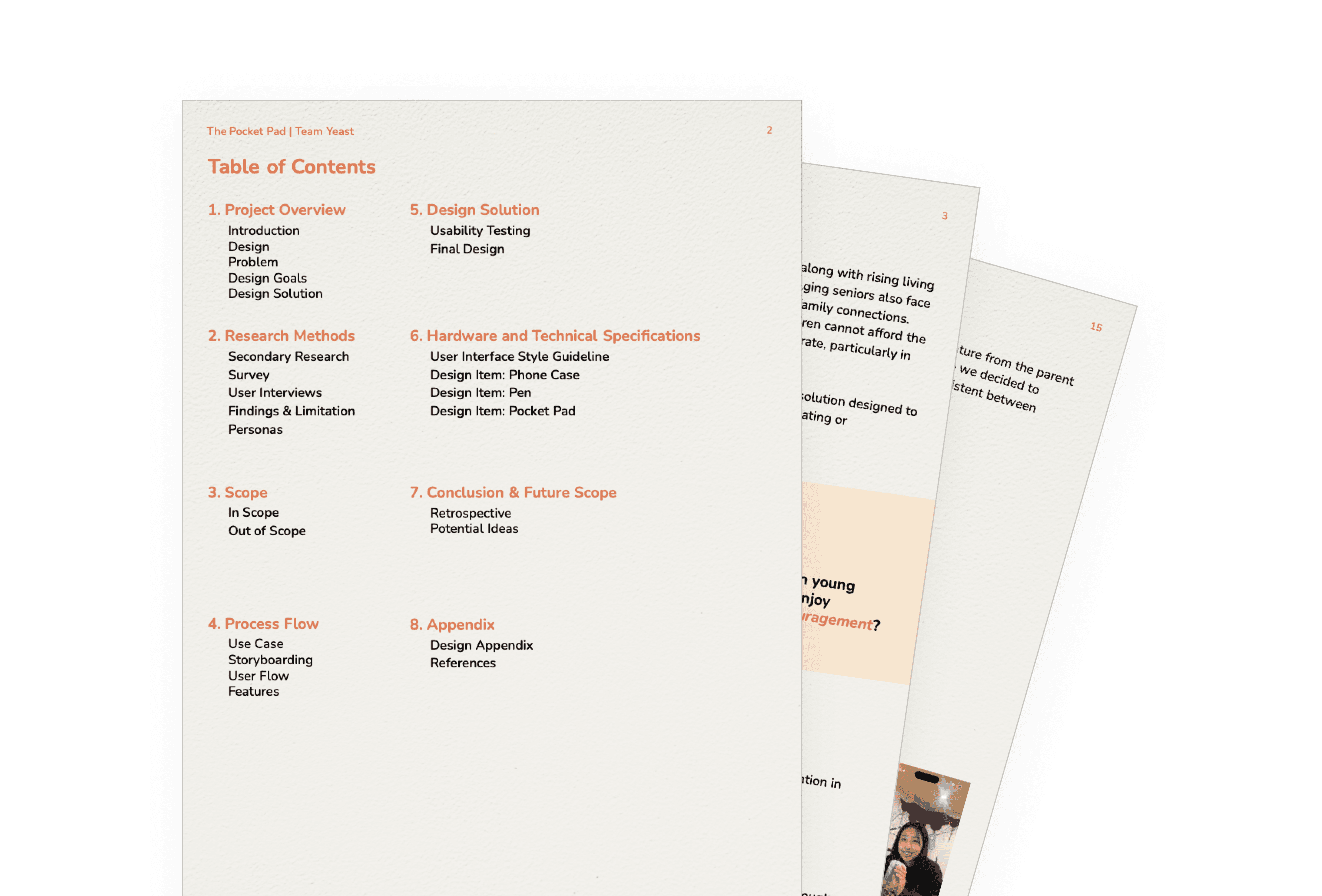
to handoff our project, We created a 23 paged design solution document detailing the project intricacies from start to finish. It outlines research, iteration, design changes...
TAKEAWAYS
Solutions can't solve for EVERYTHING
Looking back at the learnings from the past eight weeks, I grew both as a designer and a communicator. From setting clear expectations, staying open-minded to new ideas, and delegating work while taking on the role of a leader, this project taught me so much. The solution itself was hard to think of because of the complexity of the problem scope. I summarized my learnings into two main points.
Thank you for taking the time to look at my portfolio!
OVERVIEW
DESIGNS
LEARNINGS